See Also: Processing Data for Three Line Break Charts See Also: Three Line Break Preferences See Also: Three Line Break /Custom Columns Tutorial See Also: Three Line Break Technical Oscillator See Also: Three Line Break Technical Indicator
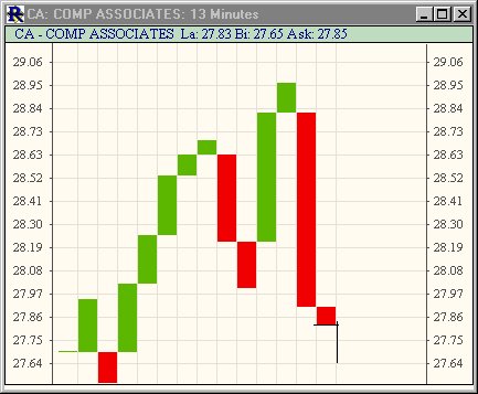
The three line break chart is similar in concept to point and figure charts. The decision criteria for determining "reversals" are somewhat different. The three-line break chart looks like a series of rising and falling lines of varying heights. Each new line, like the X's and O's of a point and figure chart, occupies a new column. Using closing prices (or highs and lows), a new rising line is drawn if the previous high is exceeded. A new falling line is drawn if the price hits a new low. In the 13 minute TLB chart below, the rising lines are seen in green, while the falling lines are seen in red.

The term "three line break" comes from the criterion that the price has to break the high or low of the previous three lines in order to reverse and create a line of the opposite color. Three-line break charts are described in detail in chapter 6 of Steve Nison's book Beyond Candlesticks . Three line break chart development has also been guided largely by Dr. Russell A. Lockhart of Undergroundtrader.com. Dr. Lockhart discusses the use of Three-line break charts (which he refers to as Three-Price break charts) in Appendix A of The Undergroundtrader.com Guide to Electronic Trading by Jea Yu. Three-line break charts allow all periodicities, including daily, tick, or any minute interval.
The Three Line Break Charts are actually Any Line Break Charts. They are not limited to just a three line reversal. You can create Two Line Break Charts, or even Eighteen Line Break Charts, if you wish.
If you wish, you may choose to have your chart process each tick after loading bars by checking the "Live Chart" checkbox. A vertical line is drawn just to the right of the last column that resulted from processing historical data. As ticks start coming in, they will be processed and appended to the chart. For example, if you have a 10 minute chart, everything to the left of the line will be based on processing the last price of the historical 10 minute bars. Everything to the right will be the result of live tick data from that point forward. The chart is labeled based on the periodicities just to the left and right of this line. To recalculate (compress) the chart, ctrl-click anywhere in the chart. If the "live chart" checkbox is unchecked, the chart will simply process a tick at the end of every period. For example, if you have a 1-minute period specified, the chart will only receive and process the closing price of each minute. Click here for more details on three line break charts.
Trendlines and Reference Lines Drawing trendlines and horizontal reference lines on TLB charts....
- To draw a horizontal reference line, just shift-click at the horizontal level in the chart where you'd like your line drawn...
- To remove that horizontal reference line...just shift-click on the line again.
- To remove all reference lines, just shift-double-click.
- To draw a trendline, ctrl-Shift-click and drag.....keep the ctrl-shift depressed and the left mouse down while dragging...mouse up when you're done drawing the trendline.
- To remove all trendlines, just ctrl-shift-double-click in the chart...
Click here for additional details on how Point and Figure and Three Line Break Charts process data.

