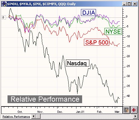
This trader's tip will discuss creating a Relative Performance Chart in Investor/RT as seen below ...

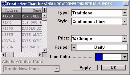
To create a Relative Performance Chart in Investor/RT, first choose from the main menu, "File: New: Chart". Specify the following settings for your new chart...

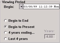
We have chosen to first chart the percent change of the close for the Dow ($INDU) as a continuous line. Also, you will need to specify a line color and thickness for your Dow percent change line. We have chosen a 1 point blue line in our example. Now click "OK", and you should get a chart showing the percent change for the Dow. But what date is this percent change being based upon? It is based on the viewing period of the chart. Double click in the horizontal scale at the bottom of the chart to bring up the chart preferences. You will see the section entitled "Viewing Period" in the upper left of the preferences window. The beginning date of your viewing period dictates the base of reference for you percent change line. We'll choose the "Begin to Present" option and give it a begin date of one year back, as seen below:

Now, each data point on the chart should show the percent change from 03/08/99. We are ready to add other securities to the chart to see their relative performance to the Dow. For each one, we will first click the "Add Instrument"  button in the chart toolbar. We will now choose the same settings as we did above in the "Create New Chart" window, except this time, we will select a different ticker symbol, and give each a different line color. Then hit apply to add each new percent change line to your chart. Repeat this process for as many symbols as you like. In our example, we added NYSE in green, S&P 500 in red, and Nasdaq in black. Once your done, you should double-click in your vertical scale and ensure that "User Multiple Scales" is unchecked, so that all lines will be using the same scale for relative comparison. In the chart seen above, I have also added a few notes and a zero reference line.

